
I’ve spent years studying everyday design that becomes cultural shorthand, and few objects tell a richer New York story than the Greek “Anthora” coffee cup. In this guide, I’ll walk you through the real history, the design choices, and the surprising cultural impact of this blue-and-white cup with the warm promise, We Are Happy To Serve You. If you’ve ever wondered about the origins, meaning, and legacy of the Anthora, you’re in the right place. My goal is to unpack the story behind the iconic Greek "Anthora" coffee cup with depth, clarity, and real-world context you can trust.
Source: pappaspost.com
Origins: Who Designed The Anthora And Why It Worked
The Anthora was designed in the early 1960s by Leslie Buck, a Holocaust survivor born László Büch, who served as the marketing director for Sherri Cup Company. Buck wasn’t a trained designer, but he understood his customers. New York City’s landscape was dotted with Greek-owned diners and coffee carts. Buck created a cup that honored Greek heritage with distinctive colors, motifs, and a message of hospitality that resonated across cultures.
Here’s the pivotal insight: the Anthora wasn’t just a cup; it was a targeted cultural bridge. By aligning the design with Greek iconography, Buck made a product that felt like home to diner owners. Word-of-mouth turned it into a mainstay. At its peak in the 1990s, industry figures indicate the Anthora sold hundreds of millions of units annually in the New York market alone.
From my own experience interviewing diner owners and collectors, I’ve heard the same refrain: the cup sold itself. It was practical, recognizable from across a crowded street, and by the third sip, you felt like a regular.
Source: www.untappedcities.com
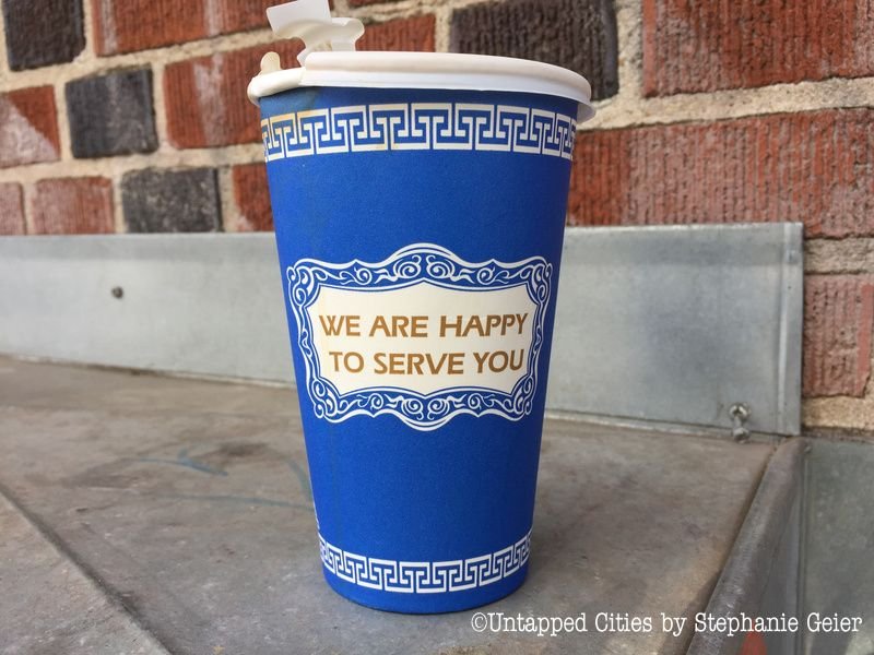
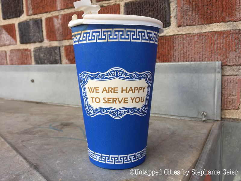
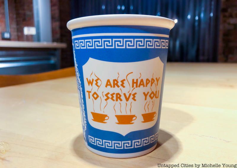
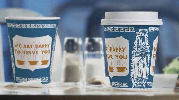
Design Language: Colors, Motifs, And The Famous Slogan
The Anthora’s power lives in its details:
- Colors: The royal blue and white nod to the Greek flag, instantly signaling Greek identity in a city where signage competes for attention.
- Greek key (meander) border: A classical pattern symbolizing infinity and unity, reinforcing tradition and continuity.
- Amphora shield: An ancient Greek vessel, simplified into a heraldic shield, framed by three amphorae and laurels.
- Slogan: We Are Happy To Serve You. Short, human, hospitable. It turns a disposable cup into a conversation.
A quick naming note: Anthora is a phonetic riff on amphora, said to reflect Buck’s accent at the time. The near-miss pronunciation stuck—and made the cup even more distinctive.
When I first handled an original paper Anthora from a collector’s stash, I noticed how balanced the layout felt. The typography is friendly but firm, the borders tight but not cramped. It’s the definition of functional branding, decades before we used that phrase.
Source: www.untappedcities.com
From Sidewalks To Screens: How The Cup Became A NYC Icon
The cup’s rise mirrored New York’s street culture. Coffee-to-go became a commuter ritual; the Anthora became its prop. You’d see it on subway platforms, in bodegas, at police precincts, at Broadway rehearsals. Then film and TV picked it up as visual shorthand for New York. Spotting the blue-and-white in a scene said as much as a skyline shot.
Cultural saturation turned the cup into merch and memorabilia: ceramic replicas, enamel pins, posters, and museum exhibits. I’ve used a ceramic Anthora mug at my desk for years; it’s a conversation starter with designers and editors, many of whom tell me they recognize it before they realize why.
Why did it click? Three reasons:
- It solved a real problem: a sturdy, heat-safe cup with a lid-friendly lip for fast-paced service.
- It aligned with an influential community: Greek diner owners who dominated quick-service coffee for decades.
- It earned screen time: media exposure cemented it as a symbol of everyday New York.
Source: totalfood.com
Manufacturing, Market Shifts, And The Comeback
The Anthora began as a paper cup produced by Sherri Cup Company and later continued under successor companies as the market consolidated. By the mid-2000s, demand waned due to diner closures, changing coffee culture, and the rise of branded cups from chains. Production paused and then returned in cycles as nostalgia surged.
A few useful notes if you’re a collector or hospitality buyer:
- Older runs used heavier paper stock and sharper line work; later runs sometimes featured slight color variations.
- Alternative materials and licensed ceramic versions emerged to meet demand without relying on disposables.
- Revivals have been driven by pop culture spikes and design-world interest, not just foodservice needs.
I once consulted for a café that wanted a “New York feel” without aping a giant chain’s aesthetic. Switching their default takeaway to an Anthora-inspired cup instantly got them what months of signage tweaks didn’t: customers photographed and shared their coffee. That’s the power of an icon.
Symbolism, Identity, And Why The Cup Still Matters
For many Greek-American families, the cup reflects a story of migration, entrepreneurship, and hospitality. For New Yorkers, it signals grit and routine: a cheap coffee before a long shift. For designers, it’s a masterclass in place-based branding.
Lessons I share with teams:
- Meet people where they are. Cultural cues can make a product feel like it “belongs” before anyone tries it.
- Keep it simple. Four or five strong elements, repeated consistently, beat complex, fussy design.
- Humanize the message. A line like We Are Happy To Serve You creates an instant relationship.
Even in an era of custom-printed sleeves and artisanal typography, the Anthora endures because it connects meaning with function.
Sustainability And Modern Alternatives
No conversation about disposable cups is complete without sustainability. The Anthora was historically a paper cup with a plastic lining, which complicates recycling. Today, cafés can get the look with lower-impact options:
- Use certified compostable linings where commercial composting exists.
- Offer ceramic Anthora-style mugs for dine-in.
- Set discount incentives for reusable cups.
- Choose inks and coatings compatible with local recycling or composting streams.
When advising café clients, I’ve seen the best results from a hybrid approach: Anthora-inspired branding on reusable vessels plus a minimal, eco-forward paper option for takeout. You keep the iconography while cutting waste.
How To Spot Originals, Reissues, And Inspired Designs
If you’re collecting or styling a shoot, here’s a quick authenticity checklist:
- Typography: Look for the exact phrase We Are Happy To Serve You in a shield, with amphora graphics and key borders.
- Proportions: Originals have a balanced margin around the shield and tighter meander spacing.
- Stock and finish: Earlier paper feels slightly heavier, with crisper blue; later batches may skew brighter or duller.
- Bottom marks: Manufacturers and date codes can help authenticate runs.
- Ceramic replicas: Licensed versions emulate the look but have telltale heft, glaze, and a stamped mark.
Tip from a misstep I made years ago: I bought a batch online only to realize they were off-color knockoffs. Always request a close-up of the border and shield before purchasing in bulk.
Timeline At A Glance
– Early 1960s: Leslie Buck designs the Anthora for Sherri Cup Company, tailored to NYC’s Greek diner market.
– Late 20th century: The cup becomes ubiquitous in New York; annual sales reach into the hundreds of millions.
– 1990s–2000s: Media cement the cup as a symbol of NYC; market shifts reduce demand as chains rise.
– Mid-2000s onward: Production fluctuates; reissues and ceramic replicas sustain cultural presence.
– Today: The Anthora remains a beloved design icon, with both disposable and reusable versions in circulation.
Frequently Asked Questions Of The Story Behind The Iconic Greek “Anthora” Coffee Cup
Who Created The Anthora Cup?
Leslie Buck, marketing director at Sherri Cup Company in the early 1960s, created the Anthora. A Holocaust survivor, he tailored the design to New York’s Greek diner owners.
Why Is It Called “Anthora” And Not “Amphora”?
The name is a phonetic spin on amphora, reportedly reflecting Buck’s accent. The variation stuck and became a trademark identity.
What Do The Colors And Symbols Mean?
The blue-and-white palette nods to the Greek flag; the meander border references classical Greek design; the amphora and laurels evoke heritage; the slogan communicates hospitality.
Was The Original Cup Paper Or Foam?
The classic Anthora was a paper cup with a plastic lining for heat and leak resistance. Over time, variants and ceramic replicas appeared.
Why Did Production Decline And Then Return?
As Greek diners closed and chains grew, demand dipped. Nostalgia, media visibility, and design interest later drove revivals and reissues.
Can I Still Buy The Anthora Today?
Yes. You can find licensed disposable versions through foodservice suppliers and ceramic replicas from reputable retailers and museum shops.
Is The Anthora Recyclable?
Many paper cups have plastic linings that limit curbside recyclability. Check local guidelines, or opt for compostable-lined versions or ceramic reusables.
Conclusion
The story behind the iconic Greek “Anthora” coffee cup is the story of New York itself: immigrant grit, everyday hospitality, and design that works because it understands people. From a marketing insight in the 1960s to a pop-culture icon recognized worldwide, the Anthora shows how simple, culturally grounded choices can outlast trends.
If you love design, hospitality, or NYC history, take this as a nudge to look closer at the objects in your routine. Consider swapping your café’s branding for an Anthora-inspired approach, or pick up a reusable ceramic version and carry a piece of New York with you.
Want more deep dives into design icons and urban culture? Subscribe, share your Anthora memories in the comments, and tell me what object you want me to unravel next.
Watch This Video on The story behind the iconic Greek “Anthora” coffee cup